WOLF retro REVIEW. 4th October 2021
This review is hypothetical and explores a synthesizer that was never built, but perhaps could have, and should have.
Interesting and factual information may be provided, but our review aims to deliver insight from the perspective of a designer’s mind and eyes.
What if?
Introduction
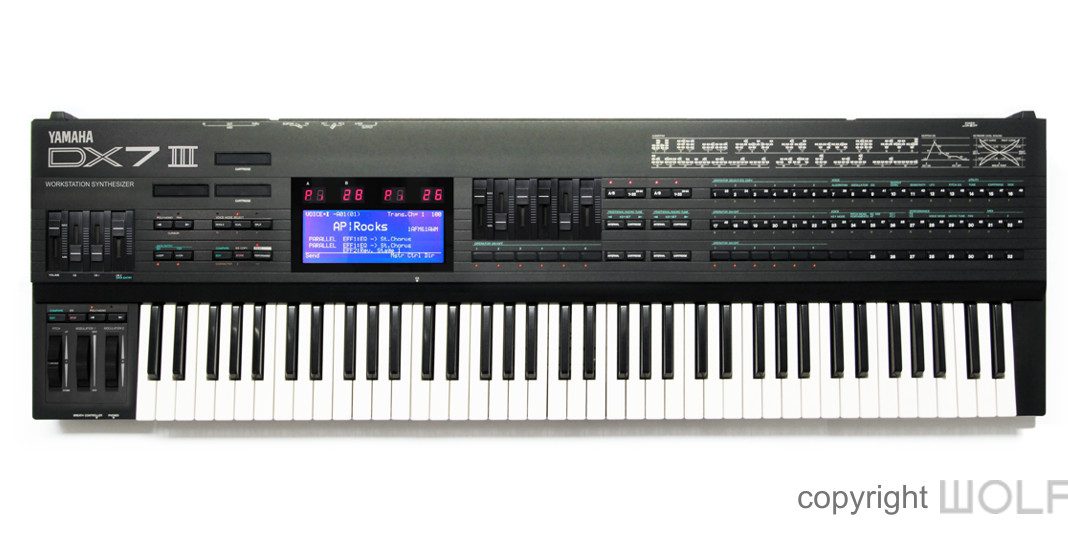
In 1987 Roland released its D-50 with breath taking sounds through the integration of sampled ROMs. KORG soon followed similarly with their M1, but with the added advantage of a built-in sequencer. Both the D-50 and M1 were FM killers and Yamaha’s DX legacy dwindled swiftly into the sunset. A V80FD was announced as Yamaha’s new flagship synthesizer and workstation, but was abandoned for the SY77 which wasn’t released until 1989. Unfortunately, by that time much of the music World was captivated by the M1, and Yamaha was no longer king of digital synthesizers. This review explores a solution that may have kept Yamaha FM alive for a little longer. WOLF Architects have retro designed the DX7III, to explore a synthesizer that could have been a game changer.
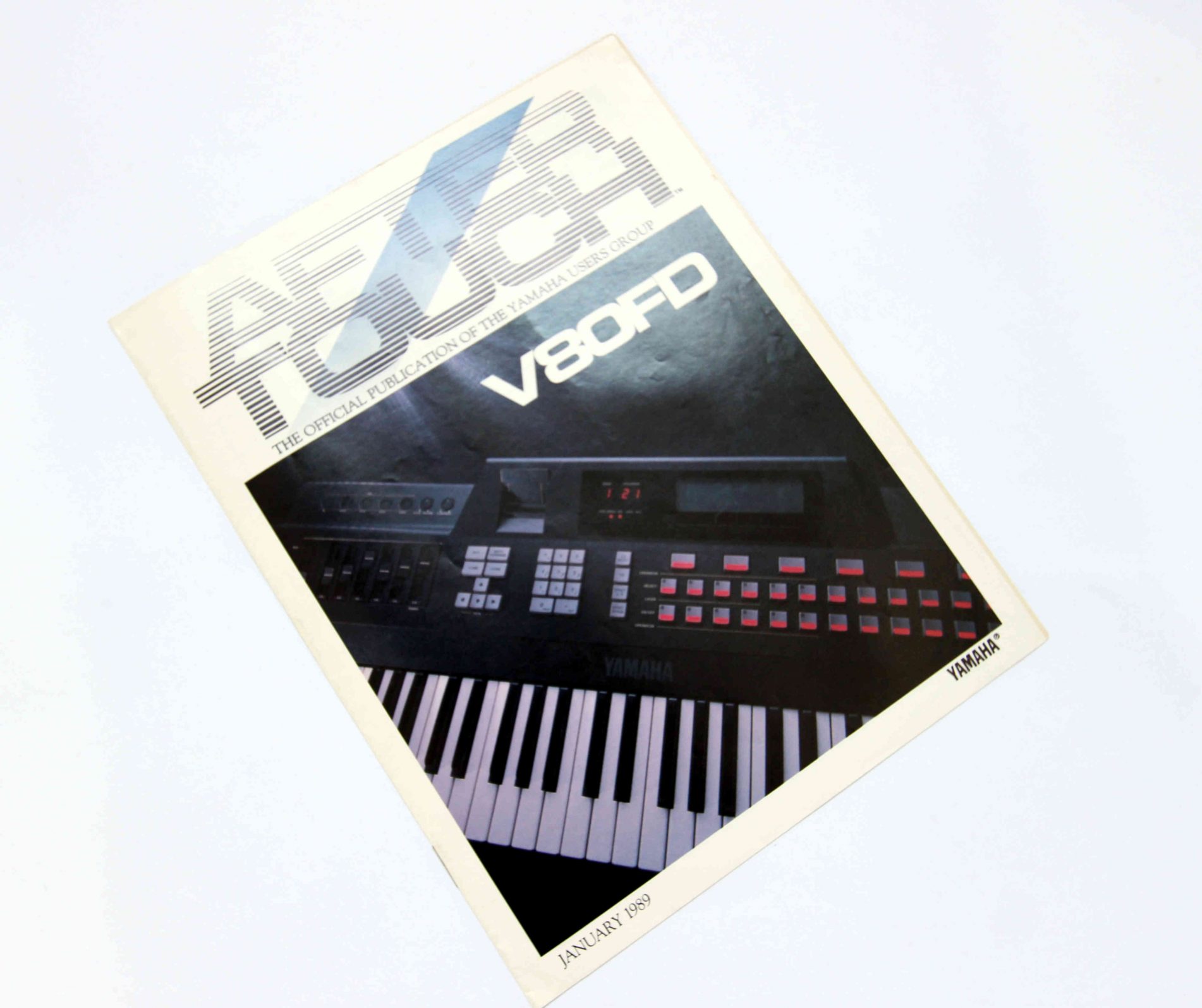
Many were disappointed when the V-80FD concept was crushed, but the DX7III could have been a game changer.
First impression/ Delight
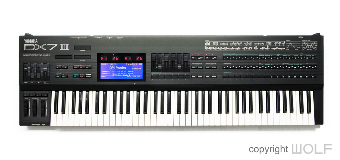
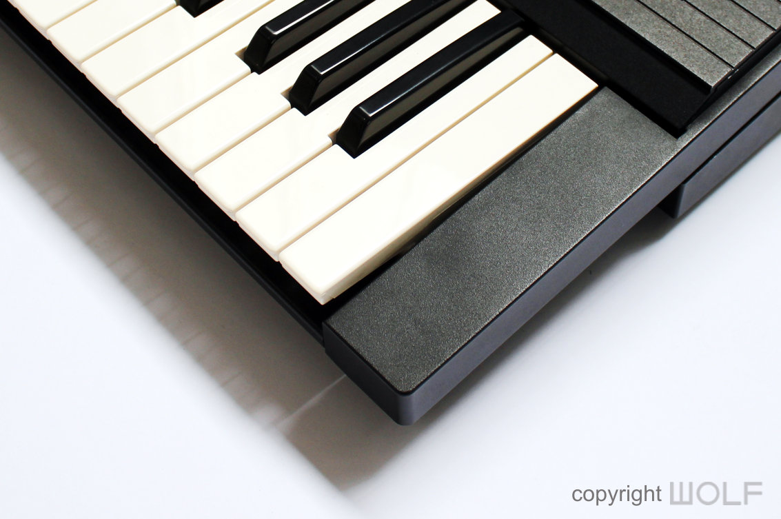
The DX7III has 76 keys and at first appears like DX7 Centennial but in black instead of silver. However, its body is a little deeper to accommodate all that additional hardware. As such it proportionately bears some resemblance to the DX5. WOLF Architects kept the same black paint and texture as the DX7II since the DX7III is an evolution and not a revolution. Nevertheless, it looks serious, professional and most importantly “Powerful”.

With 76 keys the DX7III is proportionately more elegant than its predecessors.
Exterior Design Review
Apart from the additional octave the most notable difference to the Mk II models is the large Backlit screen. It’s even larger than what Yamaha had in their SY77, and why not? A big screen in 1988 was not rocket science and would have made a world of difference. Apart from that, most details around the sides and corners remain exactly as in the previous model.
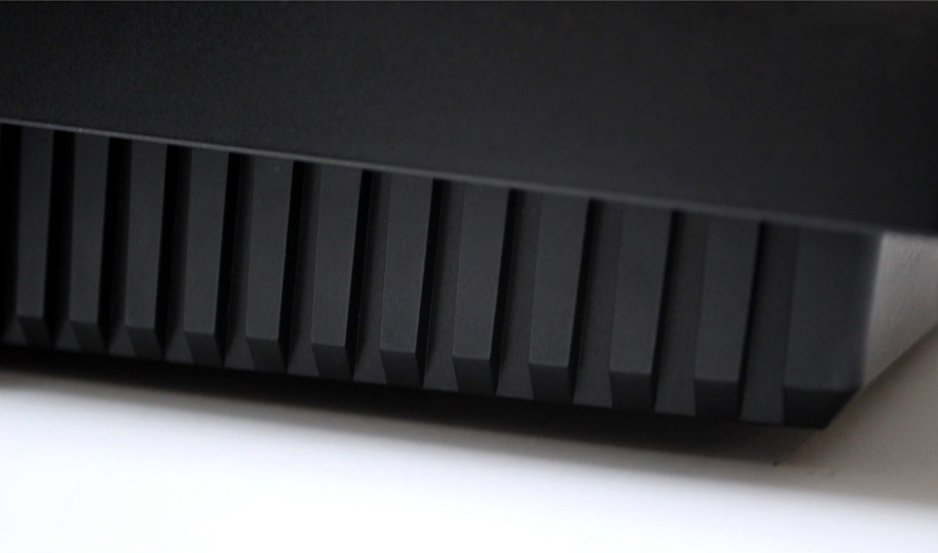
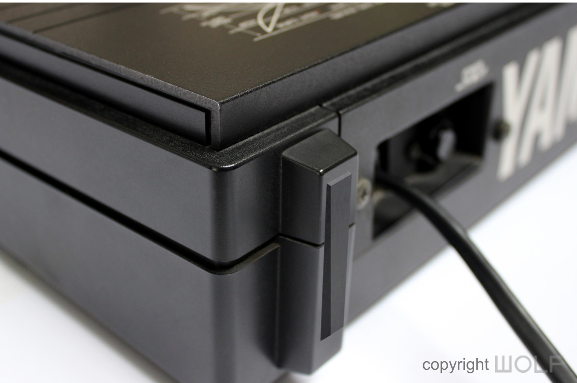
Rubber added to the rear bumpers is the only improvement over the build quality of the DX7MKII.
Craftsmanship.
The build quality of the DX7II’s left little to complain about, so the DX7III follows by example. The only improvement considered are the addition of rubber to the bumpers on the units rear for added protection.
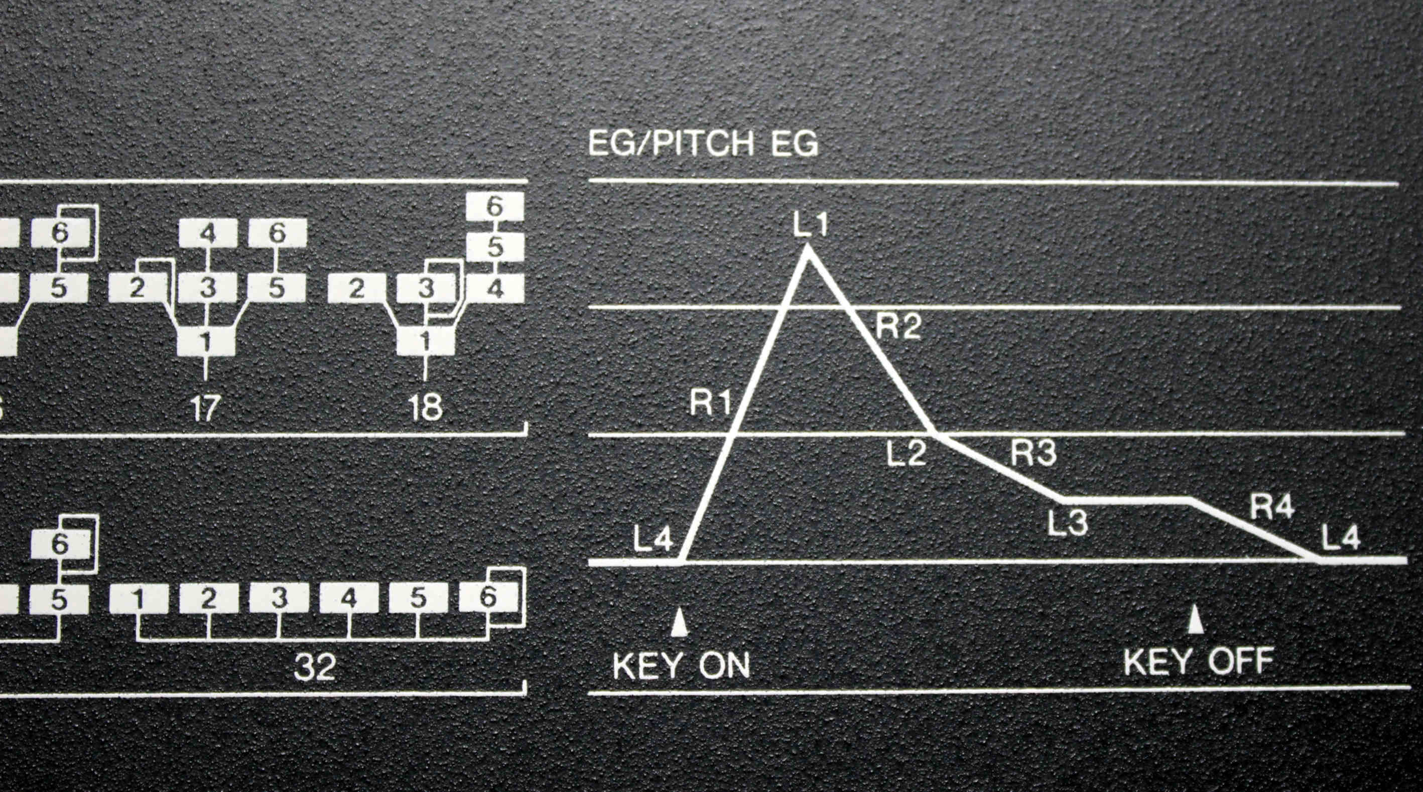
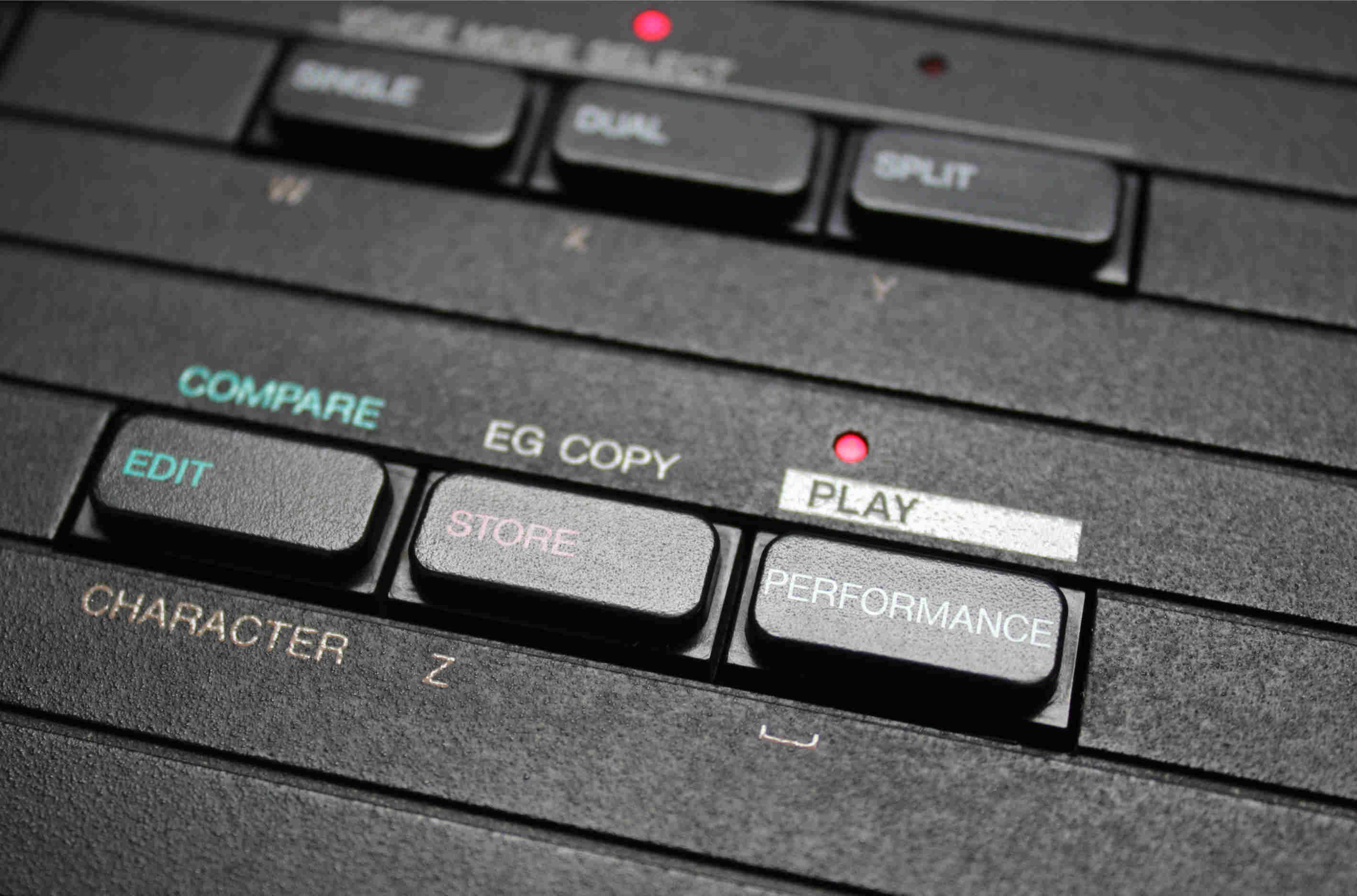
The perfect click
FUNCTION- Experience.
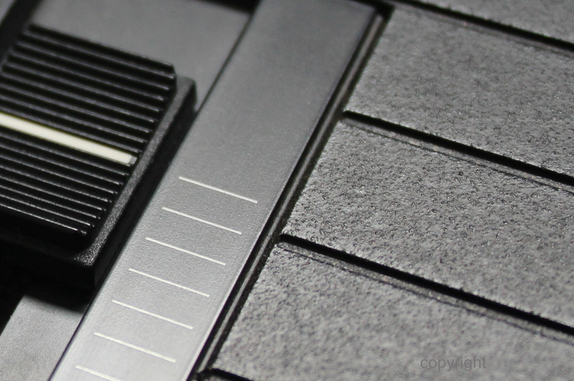
Further to an improved screen the DX7III has several more sliders, a simple idea that Yamaha would not introduce until several years later in their MOTIF range. An additional wheel can also be found on the left end panel and each wheel is beefed up to be like those introduced in their YS series. The disk drive remains on the left side as before, but with its wider body an expansion port would allow for future upgrades.
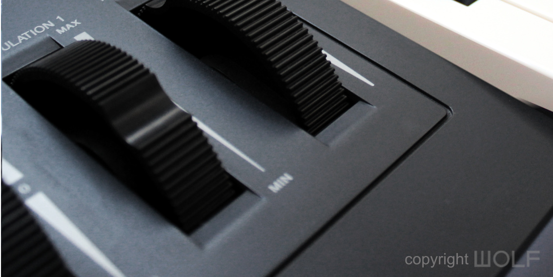
Wider controller wheels were an idea Yamaha was already exploring in their YS series synths.
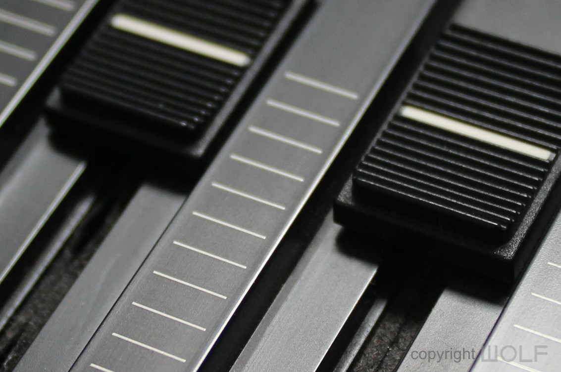
If it still work, then why change? Yamaha kept this slider & knob design across many of their synths for several years.
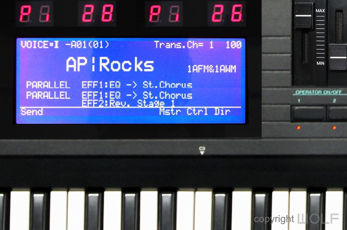
A screen that shines, even by today’s standards, though touch screen were not yet available.
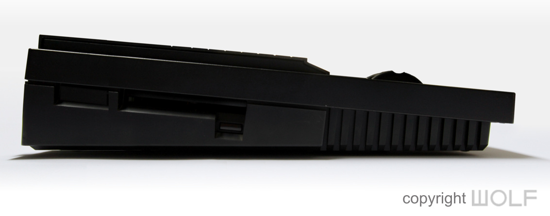
While future synths moved the disk drive to be accessible from the front, we quite like it in its original position on the side, as it keeps the front clear. Although USB had yet to be invented, the DX7III has a blank space next to the disk drive for future expansion.
Desirability / Collectability
Such a machine today would not only represent the pinnacle of Yamaha’s DX range, but a collective representation of many other technologies Yamaha had available. We don’t know how much the DX7III might have retailed for because on the one hand it packed in a lot, but on the other hand it was all from existing hardware. Keeping in mind the affordability of Roland’s D-50, and Korg’s M1, the DX7III would have to remain within reach to keep those wolves at bay.
We expect the DX7III to be expensive, perhaps even double that of the DX7II, but we think it would have still been a success and the right move to keep Yamaha on top. If only they really existed, we would certainly want one and deem them a collectible beast.
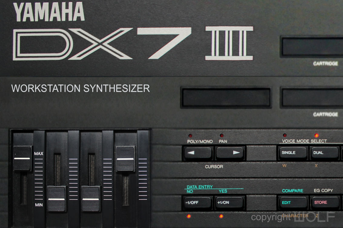
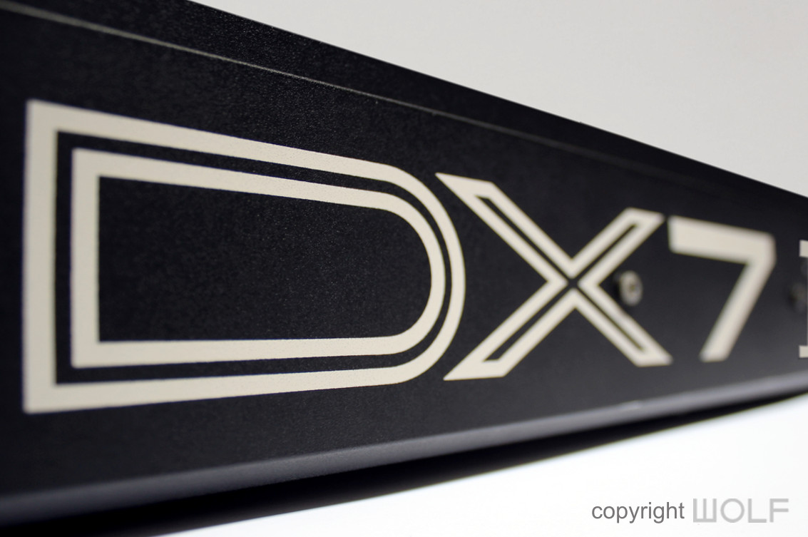
The “III” in the Logo expresses a clear evolution.
WORD OF THE WOLF
The DX7III would have been an awesome instrument with looks that are not only handsome but suggestive of the power within. While many will argue that it’s just “more of the same and nothing special”, we would ask what’s wrong with that? Yamaha’s DX7IIFD was already amazing but just lacked the “more”. With a TX16W sampler, QX3 sequencer, and REX50 effects processor built in, you wouldn’t have to buy another instrument for many years. Yamaha could have skipped the SY77 altogether to release the SY99 instead (but with a bigger screen please).
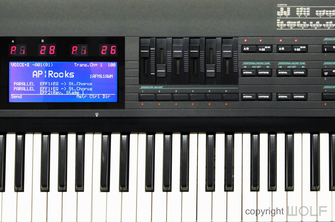
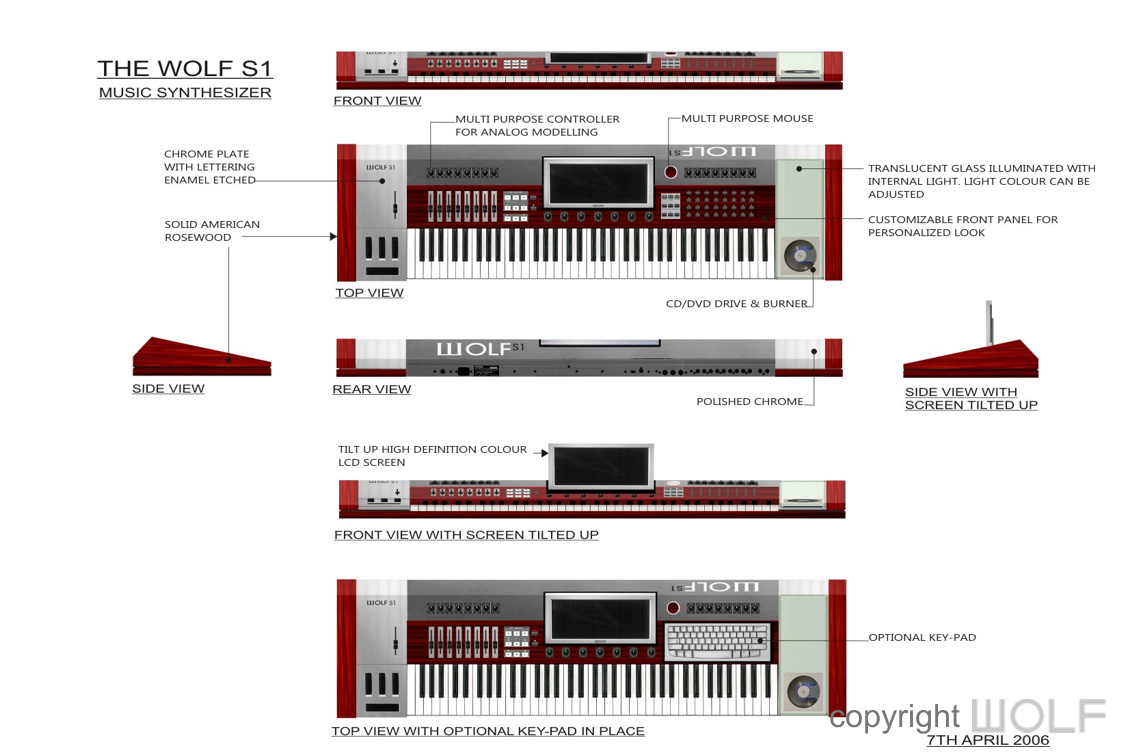
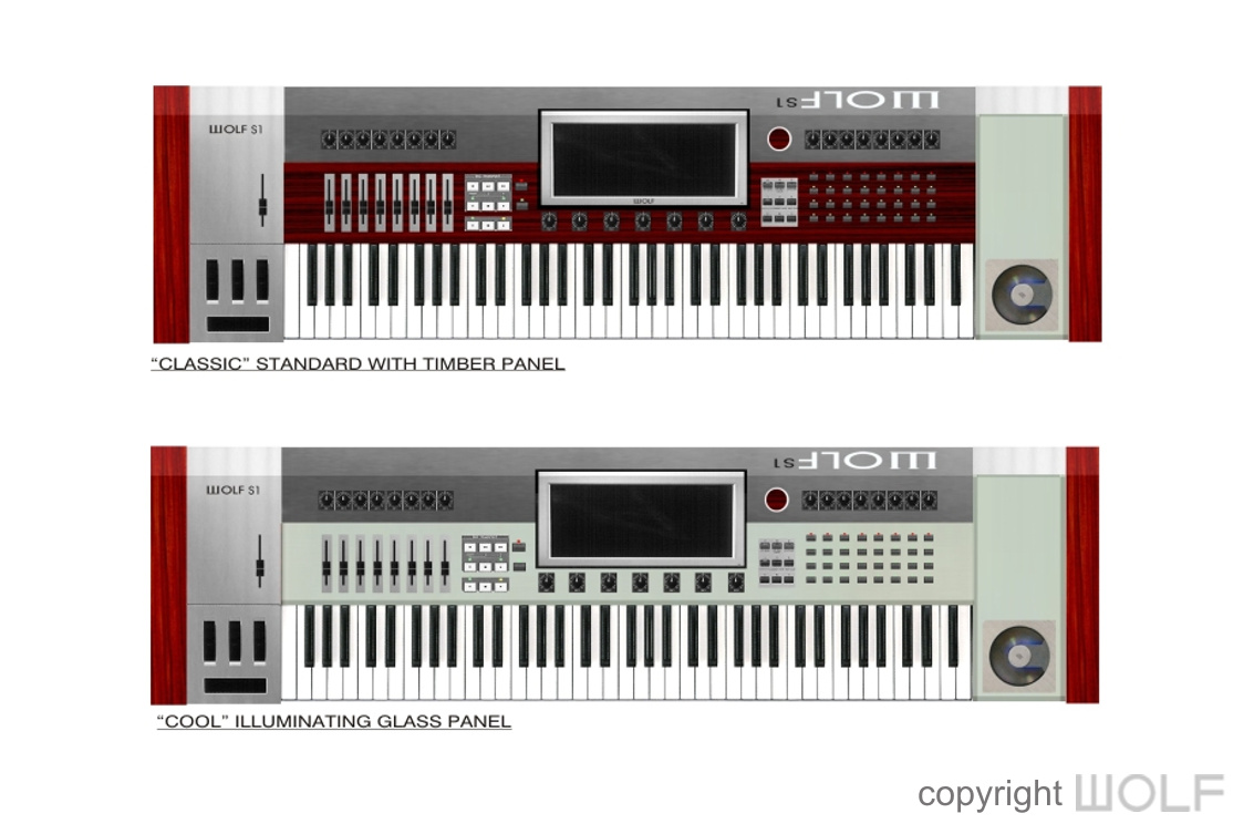
The DX7III was not WOLF Architects first synthesizer design challenge. In 2006 they designed a synthesizer from scratch and called it the WOLF S1
WOLF DESIGN EXCELLENCE SCORE = 8.3
Disclaimer
The information in this review is intended for informational or educational purposes to provide readers an understanding of how something may be seen from a certain design perspective. In this case it is from the view point of WOLF DESIGNS. As design is subjective this review should only be considered as an independent opinion. Information further to being of an opinion is provided to the best of our knowledge based on our own research at the time of doing the review. We cannot be held responsible for any inaccuracies or inconsistencies and reserve the right to change or update any content as appropriate.
The final responsibility of the design resides with the original manufacturer.
