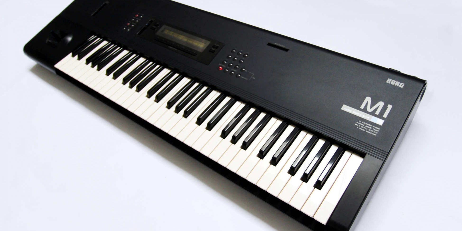
WOLF DESIGN retro REVIEW. 11th November 2019
A retro review looks at products that are at least over ten years old from a present-day design perspective. While the technology and fashion of an era can influence design, and are to be taken into consideration, a great design idea can transcend eras to be timeless.
Interesting and factual information may be provided, but our review attempts to discover any feelings, emotions or questions that arise from superior design. Our hope is to provide some insight into the eyes and mind of designers.
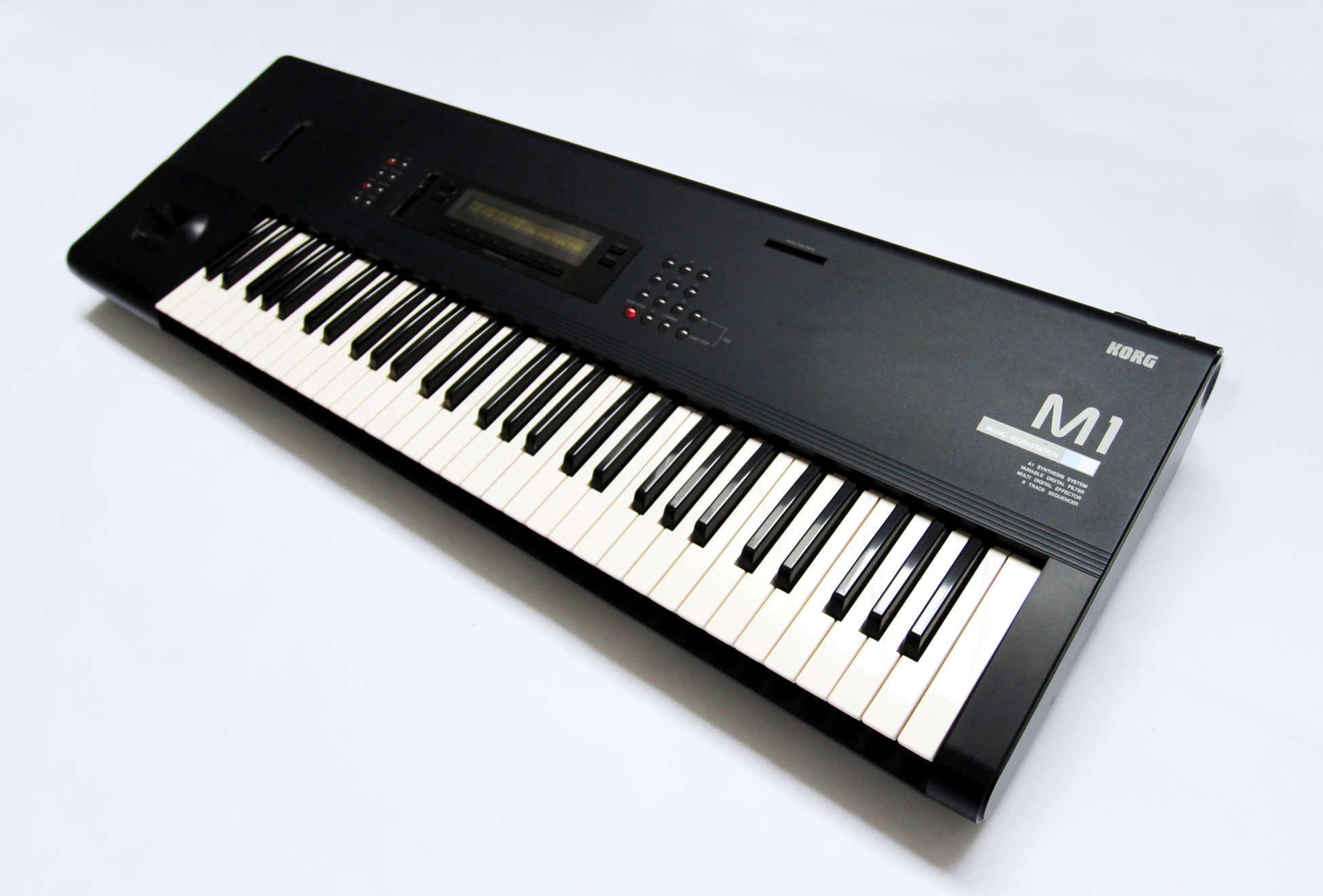
Ahead of its time in design
INTRODUCTION
Product Focus
As with most reviews the focus is on the design and its evolution with the synthesizer. The functioning systems and sound quality are not necessarily considered.
Product description
In 1988 KORG stood up tall against Yamaha and Roland with the launch of their M1. Competition between the three brands has since continued till present day. KORG’s M1 did its best to push the DX7 and D50 aside as best synth of the 80s. With a total sale figure of approx. 250,000 units and commonly regarded as the first music workstation it certainly earned its place in synthesizer history.
Price and Availability.
With so many units produced there is always an M1 for sale and they can be more expensive than the Yamaha DX7 or Roland’s D50. A mint example however is very rare because these synths were well used. Furthermore, the plastic componentry on the units were not as robust in design and finish to survive long term from a cosmetic perspective.
Additional information
With built in effect, drum sounds and an onboard sequencer the M1 marketed itself as a complete workstation. While considered the first it technically was not, as there were other synths that came before with built in drums and sequencers.
REVIEW
First impression/ Delight
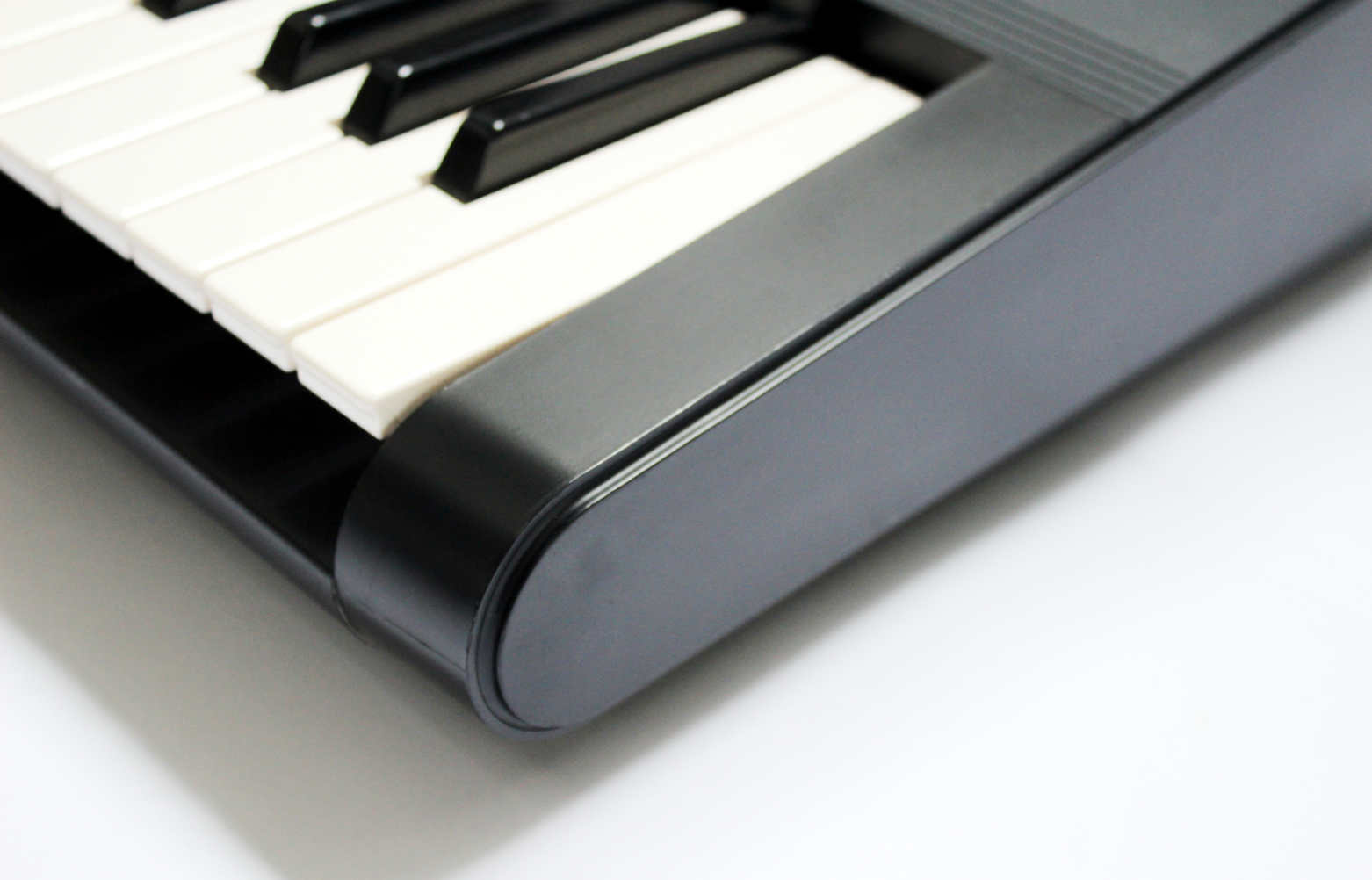
The M1 is still as minimalistic today as it was in 1988. Synths don’t lend themselves to having curves and the M1 is today still one of the Curviest synth shapes in existence.
Exterior Design Review.
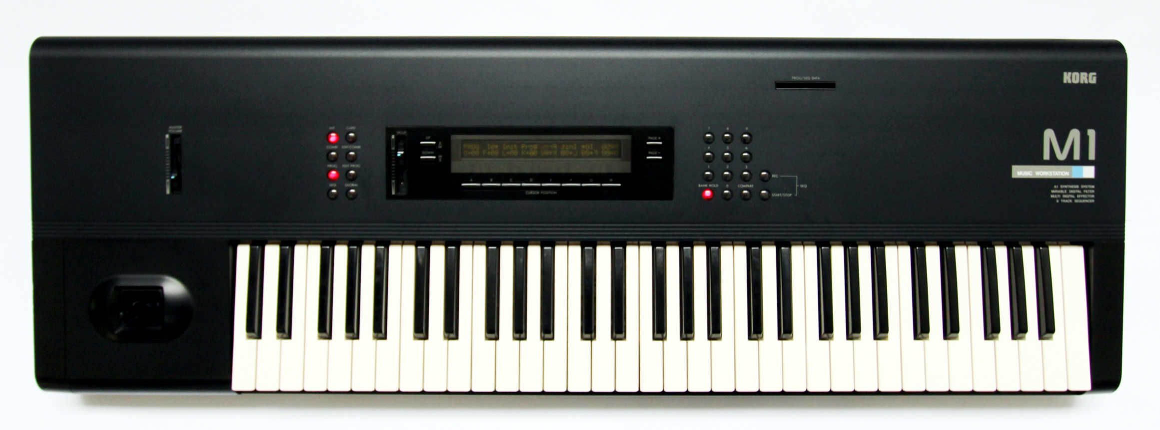
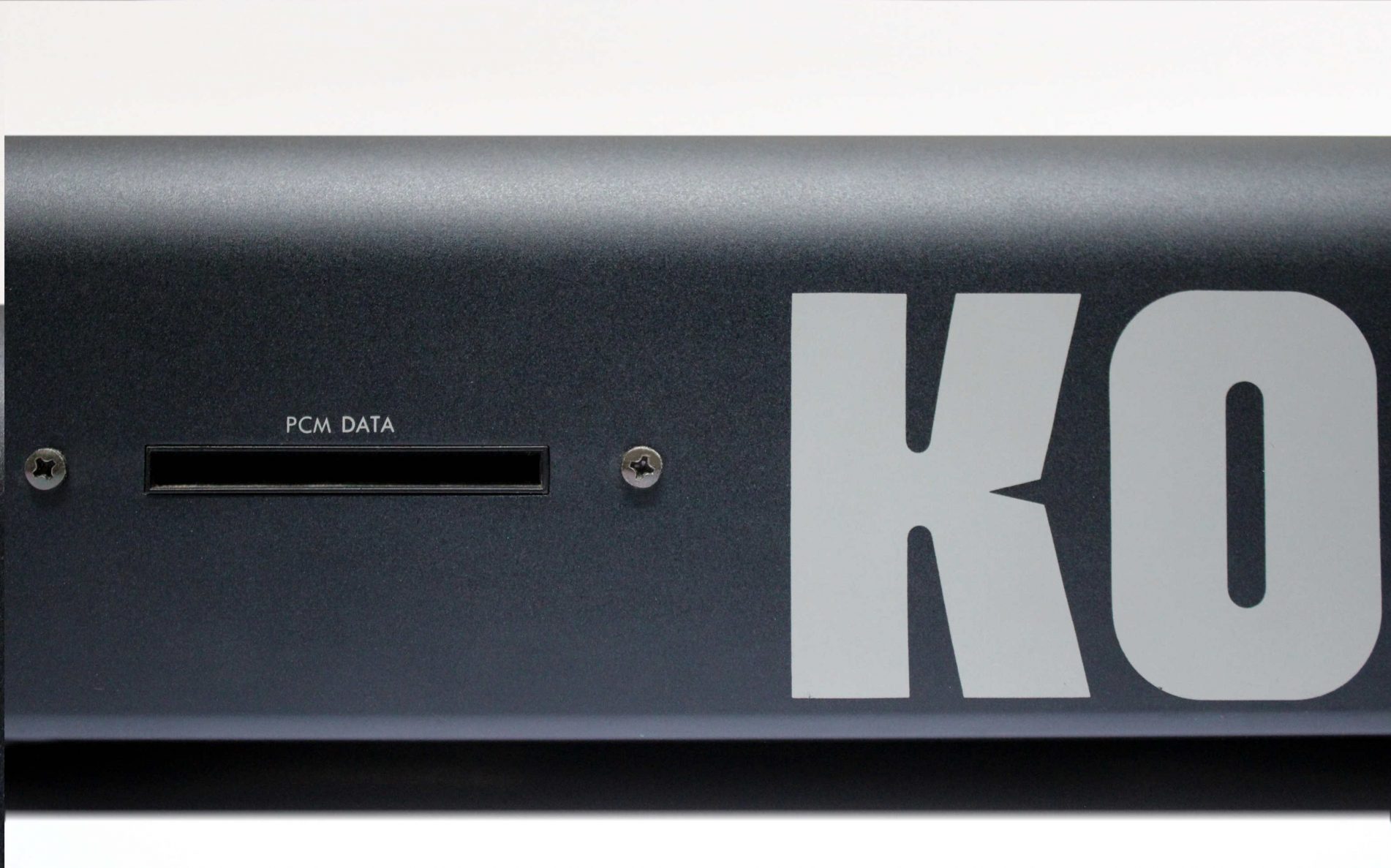
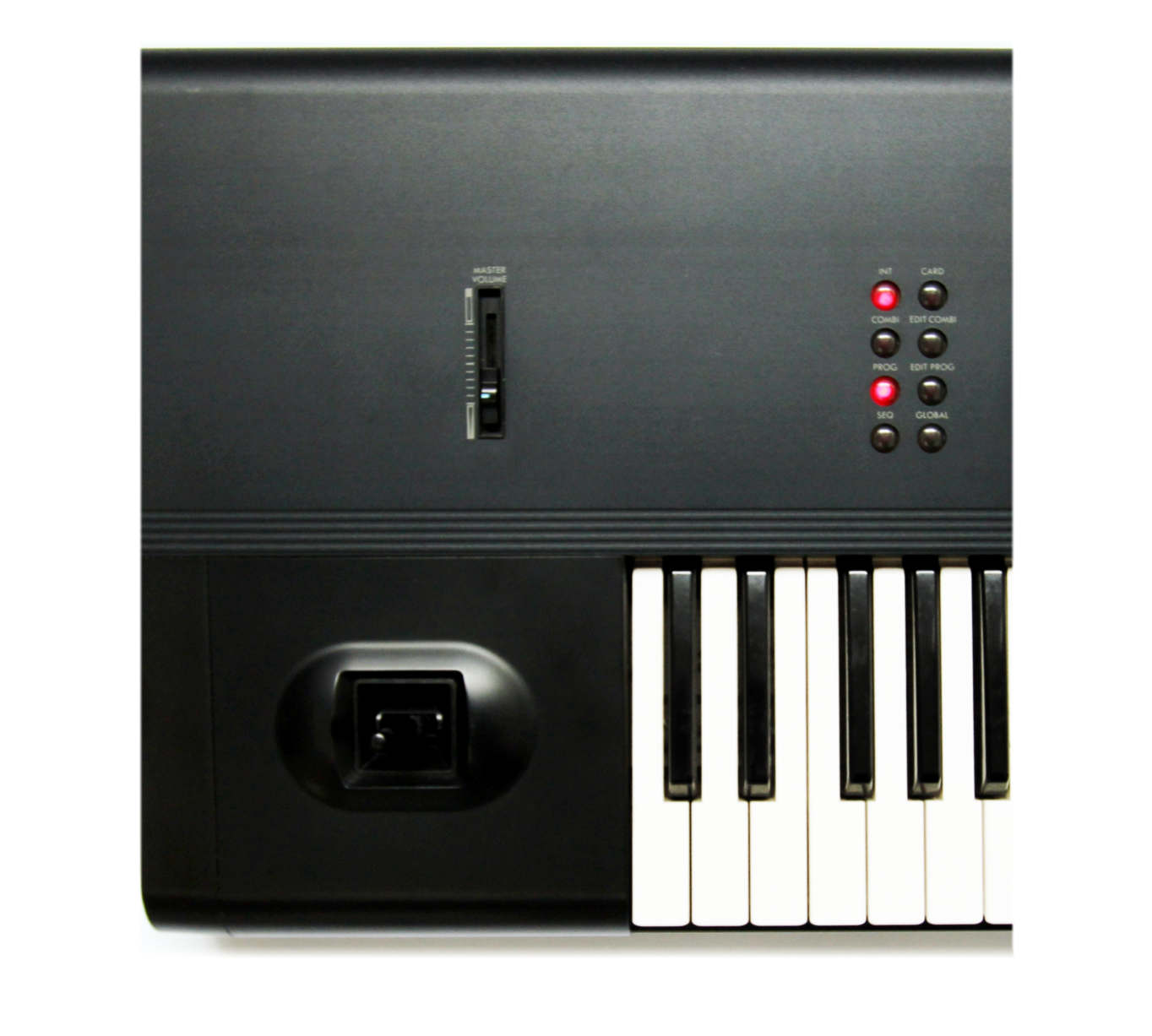
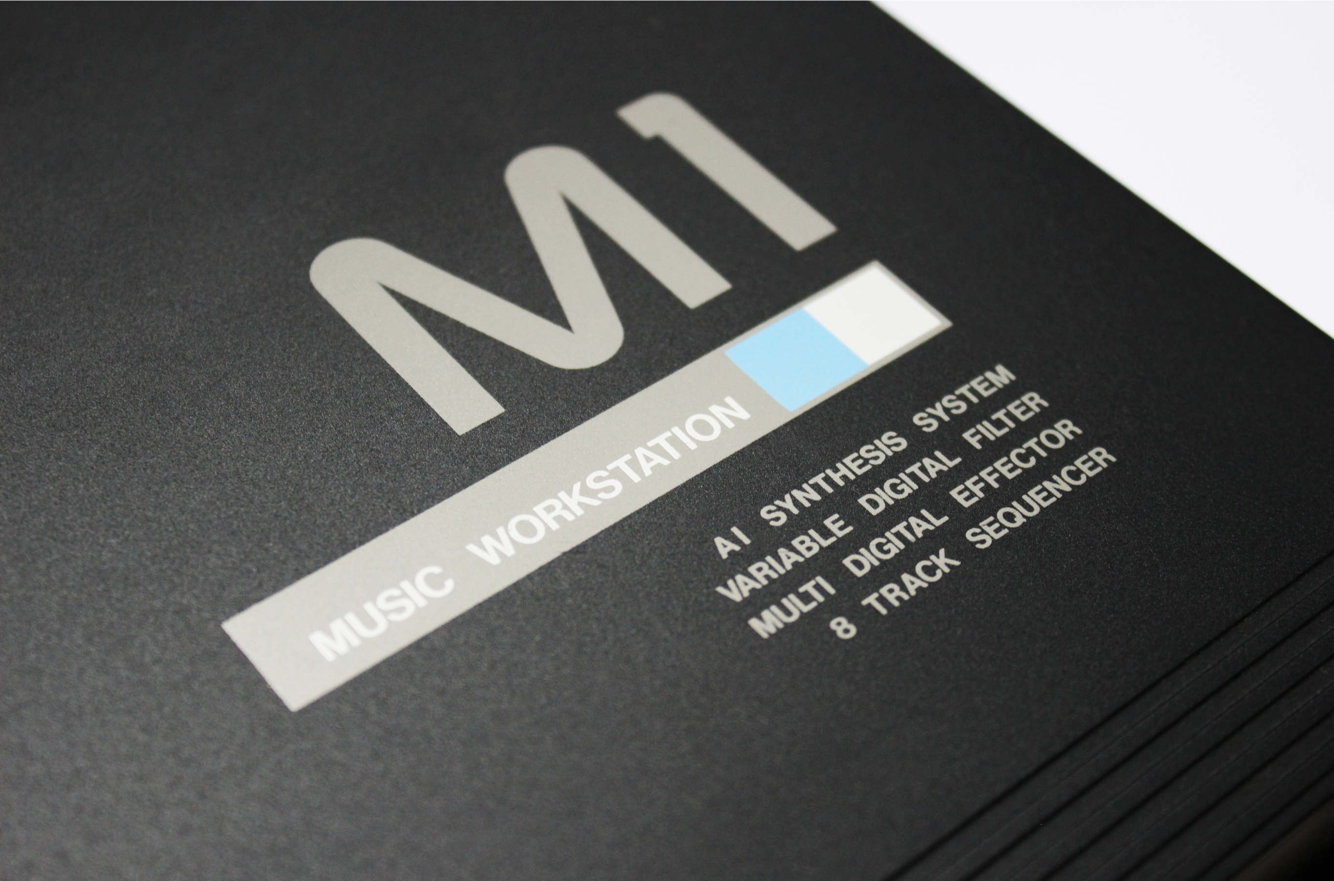
KORG was out to make a big statement with the M1 and that began with a fresh new look. Its design was indeed a break from the traditional angles and strong lines of the 80s. How to make a machine as simple, clean and curvy as possible sums up a possible design brief? The main panel is a single sheet of metal that curves away at the top edge and down the back. It has a slightly grainy texture that feels nice to touch and teases you to run your hand across the curved top edge.
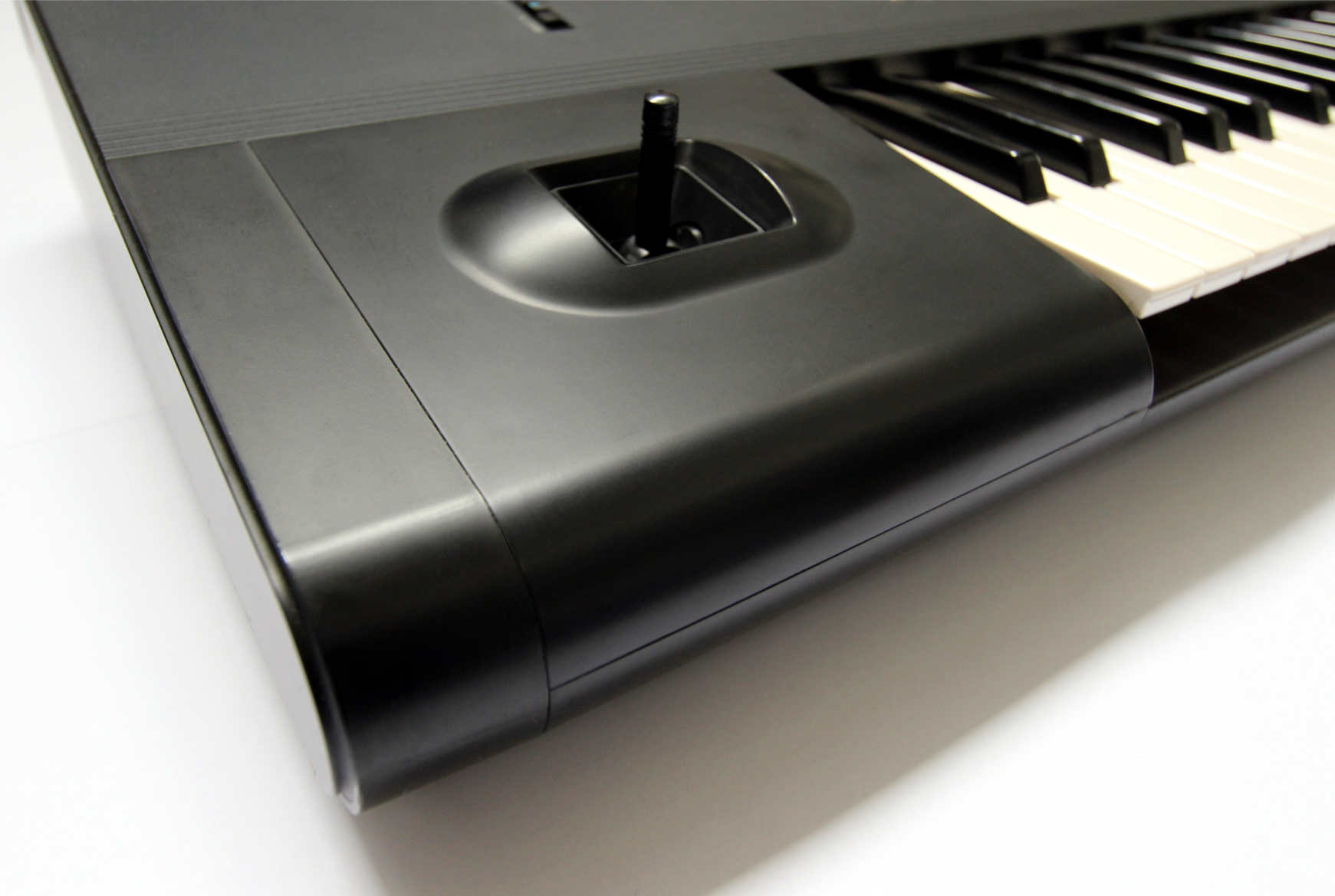
There is a single Joystick placed with some importance by itself on the left end of the unit. This pitch bender and modulation wheel was an attempt to depart from Roland and Yamahas Pitch bender designs. The design of the stick however does resemble that on Roland’s D-50.
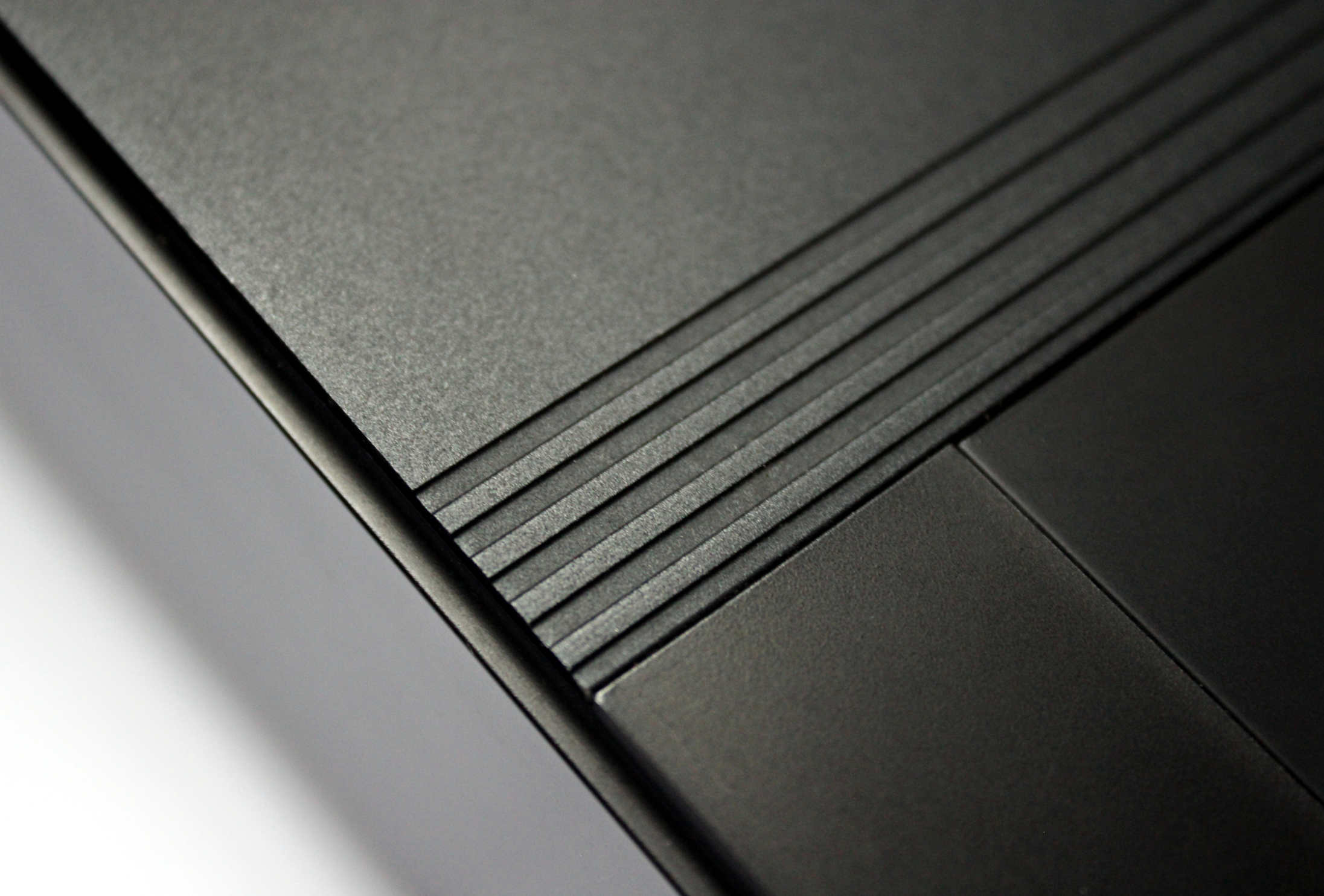
Where the front panel meets the keys there is a continuous band of five groove lines which are one of the M1’s few decorative features. An almost identical feature is found on Yamaha’s DX11 that was released around the same time as the M1. That seems an interesting coincidence given that Yamaha had significant ownership of KORG around that time.
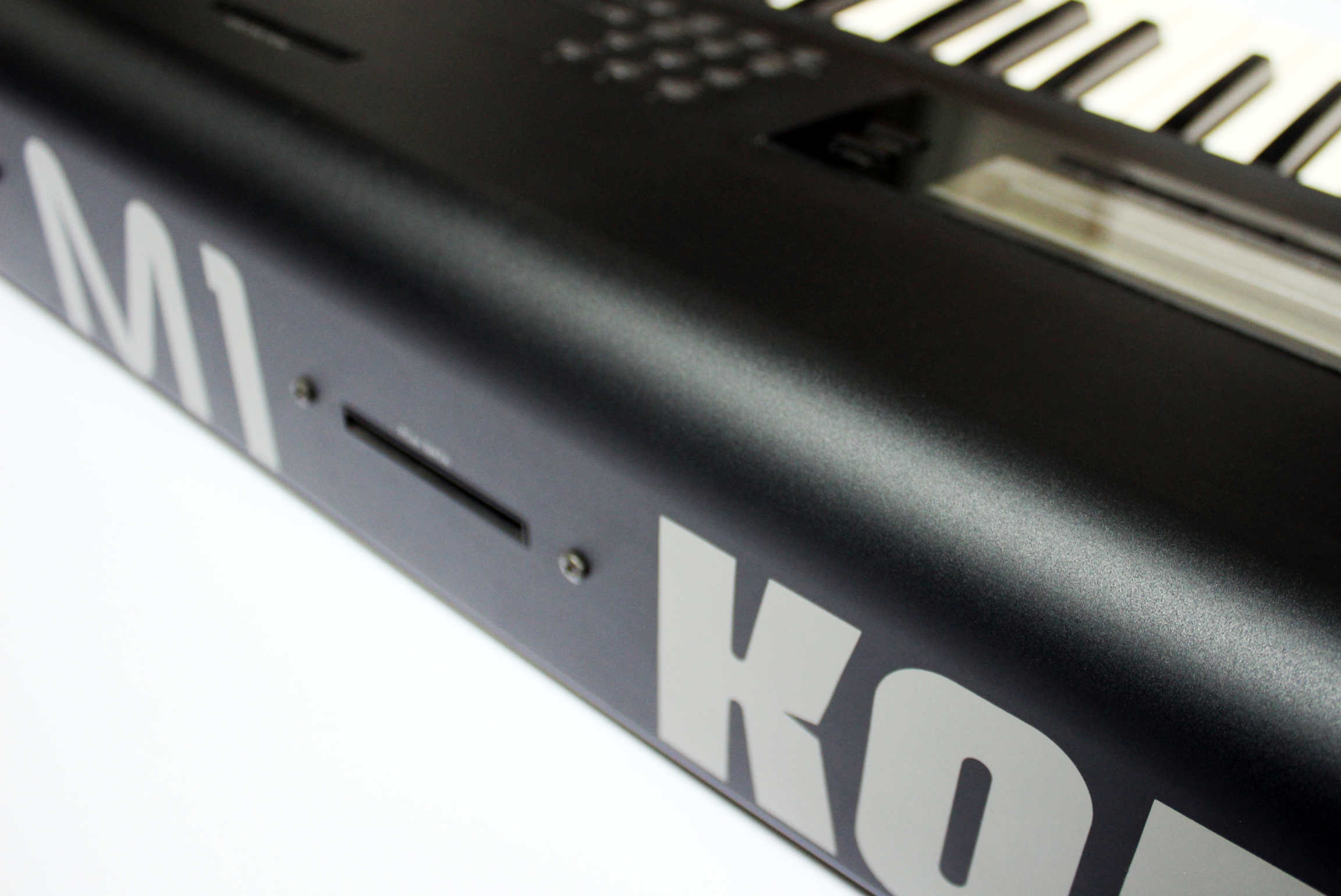
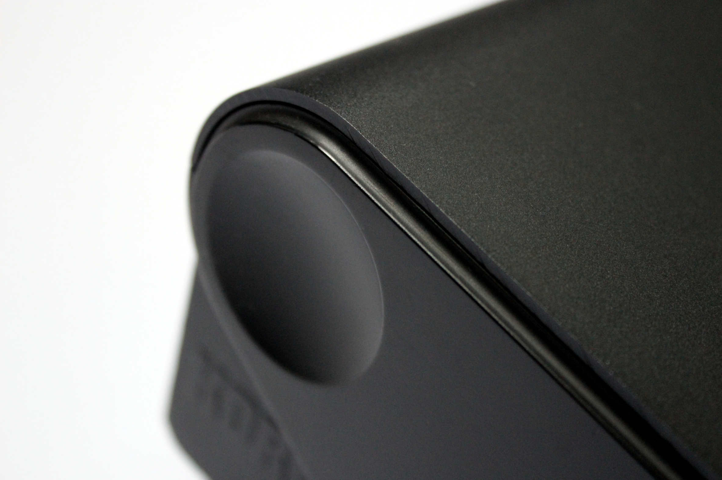
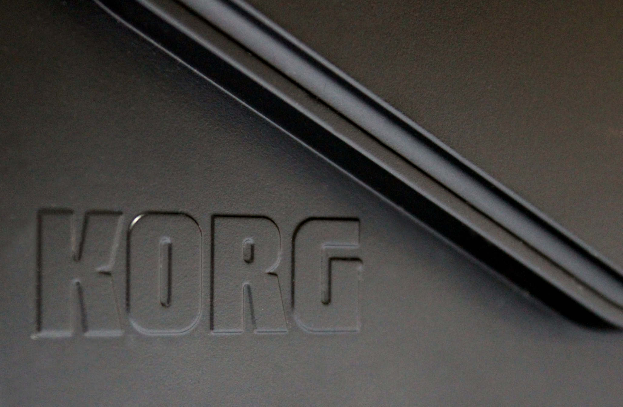
Design considerations to the side panels are unique and well balanced. There is concave circle on the top end that accentuates the thick metal plate curving around the top to the rear. Underneath this detail is the KORG brand logo in slightly raised print. It’s a subtle detail that’s not noticeable but worth noticing.

Craftsmanship.
The craftsmanship on the M1 confuses us in the sense that it’s fairly robust in build yet difficult to preserve in good condition unless it’s rarely used. The metal on the main front panel is thick and hard to dint but the plastic end panels seem rather soft and easily marked. The left end panel that houses the Joystick should probably have been out of metal or made out of a more textured plastic. This is an area where the hand is always placed and shows the most signs of surface ware.
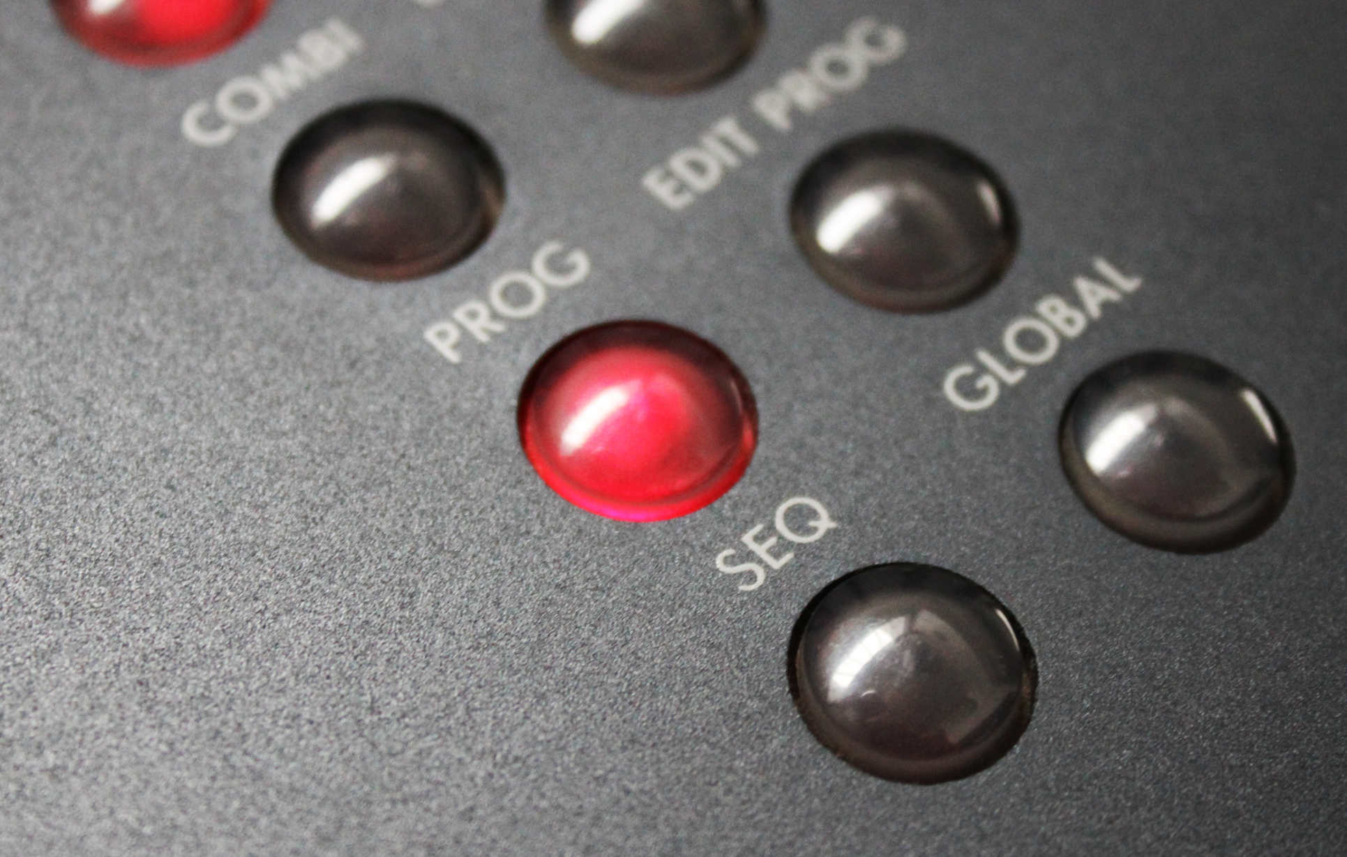
The Smartie chocolate shaped buttons glow like red fish eyes and work well but don’t feel great in our opinion.
The yellow screen feels borrowed from Yamahas DX7 mk2 but housed in a larger plastic frame. This acrylic casing feels rather thin and easily scratches. We’ve never seen one that doesn’t look old.
FUNCTION- Experience.
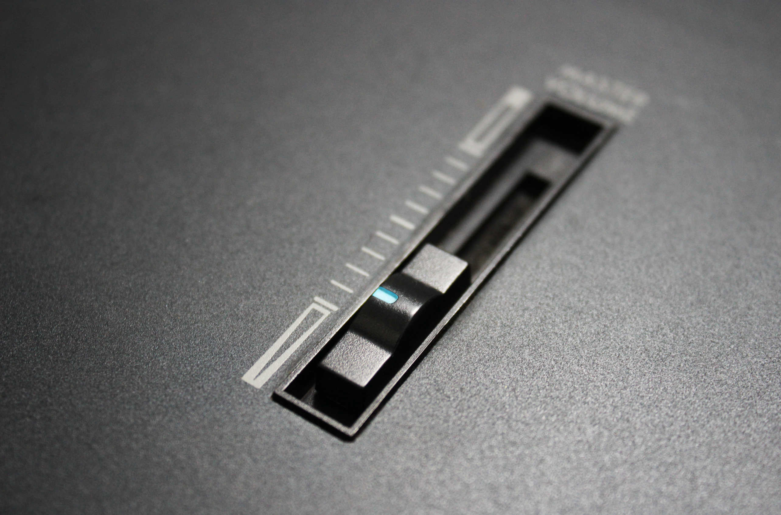
The M1 has fewer buttons than it should in our opinion. While keeping it minimal was a good discipline, it can make it harder to navigate, especially as a workstation. Even the two sliders were designed to be as small as possible. The volume slider left out on its own looks rather lonely and out of place.
The bold prominence of the joystick sets expectations for something significant but in reality does not look or feel particularly special and this was disappointing given that it looks so important.
While the M1 was advanced in so many ways it puzzles us as to why KORG couldn’t build in a disk drive in 1988 which Yamaha already managed back in 1986 on their DX7IIFD.
Desirability / Collectability and what to look for.
The M1 was to KORG what the DX7 was to Yamaha and what the D-50 was to Roland. It was their most successful commercial digital instrument that influenced a lot of music. As such it will remain as legendary and iconic as its closest rivals. It has followed on from the DX7 and D-50 in terms of appreciation and collectability.
Because of its popularity the majority are still in use and therefore well worn. The soft plastics on this unit damage easily and even well cared for examples tend to look used. The large front panel is prone to scratching and surface ware. All the edges tend to get knocked around and the plastic components on these units feel soft and vulnerable. In our opinion the M1 is the hardest amongst the trio to find in mint condition. Be prepared to pay over $1000 for the best examples and maybe more if it come with case and accessories. Original M1 cases are rare and seem to exist mostly in Japan.
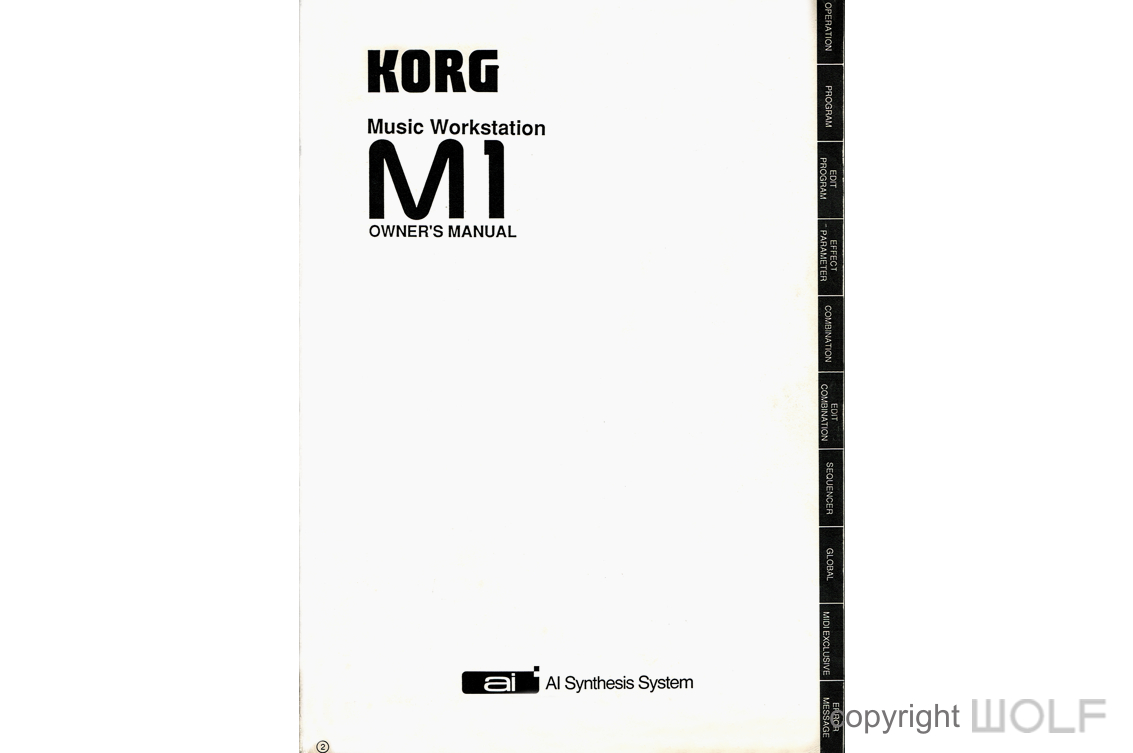
The manual
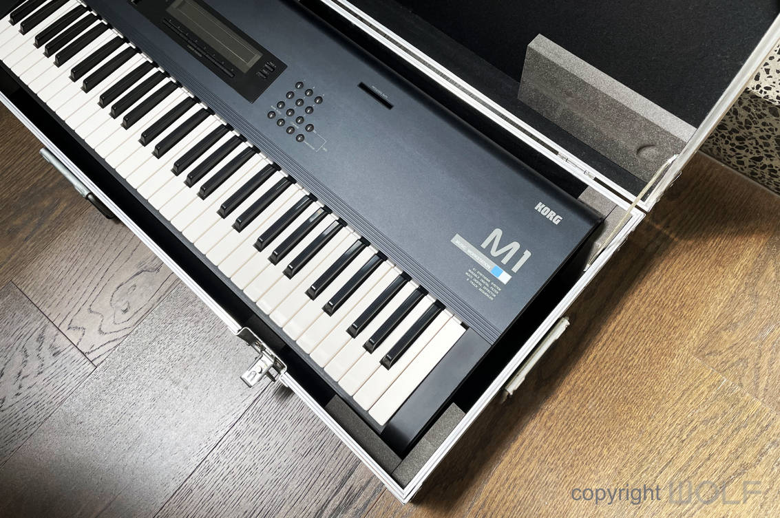
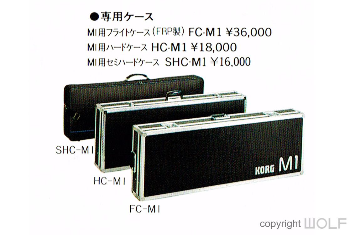 The M1 had 3 different cases- A semi-hard case, hard case and flight case. The flight case (FC-M1), appears to be the most expensive and rare, and from our research exists in two different variations. The early cases appear to have just KORG printed on one side. The later versions had Korg M1 printed in Silver..
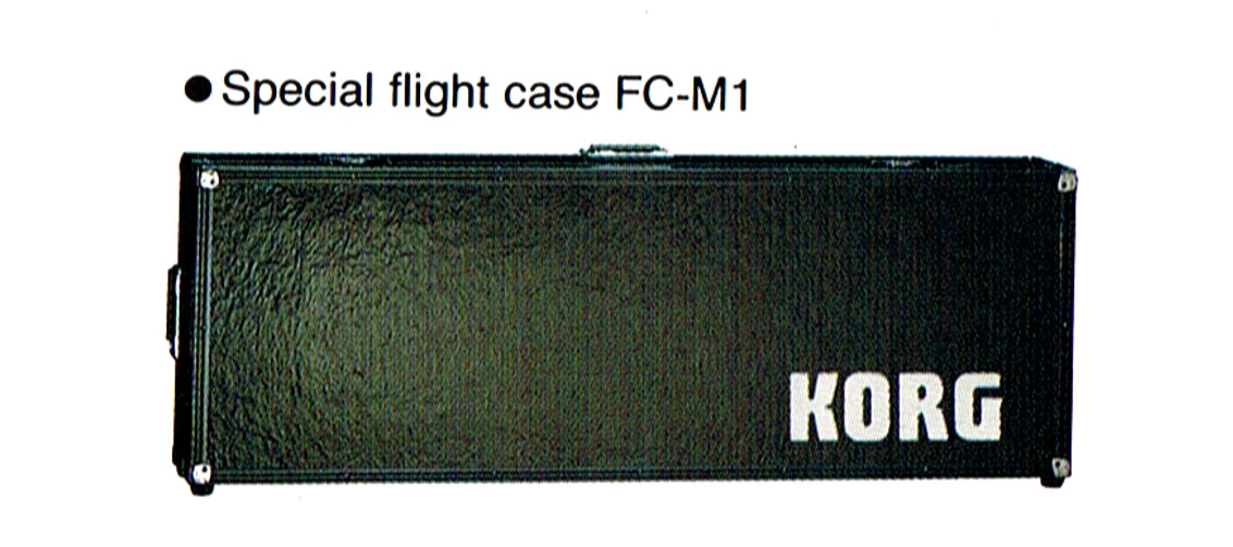
The early cases appear to have just KORG printed on one side.
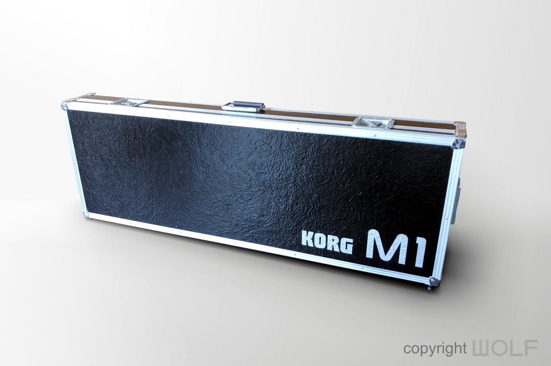
The flight case above has a very similar texture to Yamaha DX5 case and with Korgs association with Yamaha at that time we wonder if it borrowed the same material from Yamaha? The silver lettering was a nice touch!
WORD OF THE WOLF.
The M1 was ahead of its time for 1988. It’s a design that belongs in the 90s and seems appropriate that its sounds influenced so much music of the 1990s. It is the synthesizer that ushered in the era of workstations and definitely the one that put KORG on the map and up against synth giants Roland and Yamaha- A rivalry that has continued until today.
It has not attained the same classic status as the DX7 or D-50 but that’s mainly due to it plain and simple looks. Don’t underestimate their value and collectability as good examples become increasingly hard to find. Our advice is to find a good one soon before the last of the mint ones get snapped up by collectors.
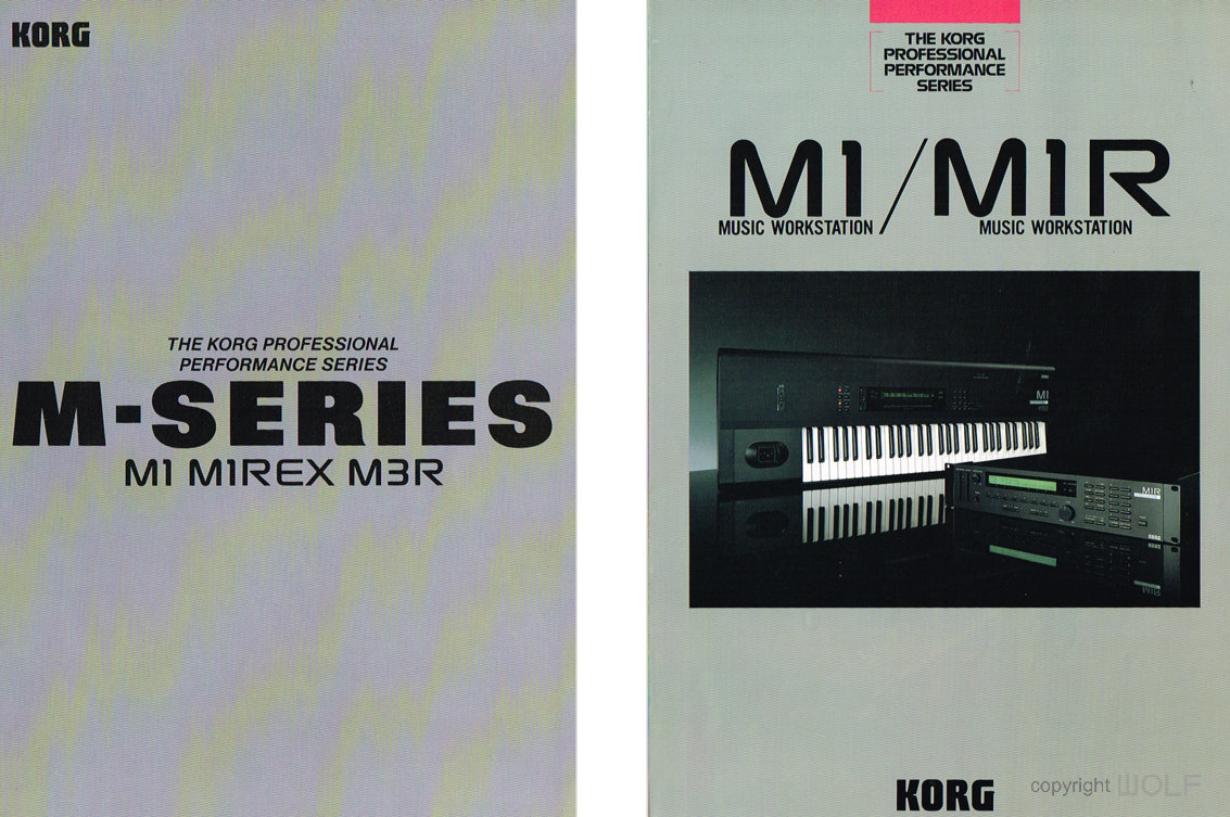
The M1 had at least 3 dedicated brochures. Above are brochures featuring the M1, M1REX, M1R, & M3R
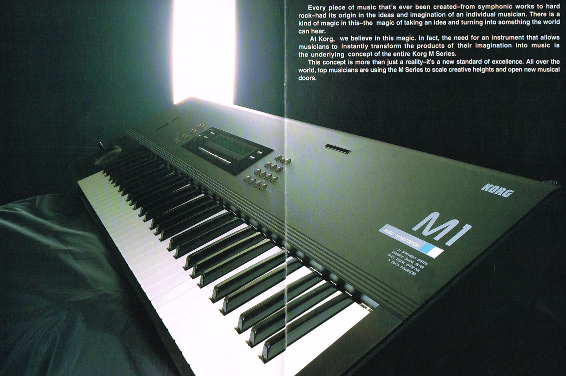
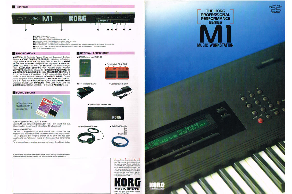
Above is the original M1 brochure coinciding with Korg’s 25th Anniversary.
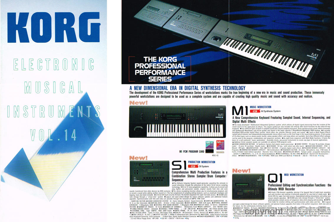
Above is a general electronics instrument catalog featuring the M1 with S1 and Q1 designed to match the M1 profile.
The WOLF M1
With Yamaha’s DX7 and Roland’s D-50 already in the Wolf collection the M1 was the last of the trio. The M1 was the first ever KORG in the WOLF collection. Purchased from NSW it was the best M1 on the market. It was far from perfect and required many hours of restoration to bring up to WOLF standard.
 WOLF DESIGN EXCELLENCE SCORE = 7.4
Disclaimer
The information in this review is intended for informational or educational purposes to provide readers an understanding of how something may be seen from a certain design perspective. In this case it is from the view point of WOLF DESIGNS. As design is subjective this review should only be considered as an independent opinion. Information further to being of an opinion is provided to the best of our knowledge based on our own research at the time of doing the review. We cannot be held responsible for any inaccuracies or inconsistencies and reserve the right to change or update any content as appropriate.
The final responsibility of the design resides with the original manufacturer.
