WOLF DESIGN REVIEW. 8th October 2017
A Design Review focuses on a product primarily from WOLF design and craftsmanship perspective. While the technology and fashion of an era influence design, and are taken into consideration, great design ideas will transcend their eras to be timeless.
Interesting and factual information may be provided, but our review aims to deliver insight into the eyes and mind of designers.
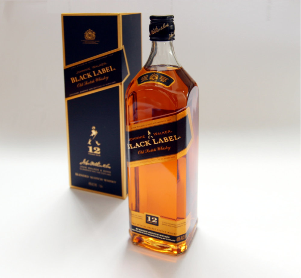
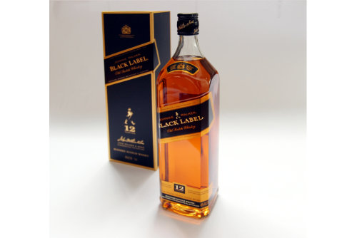
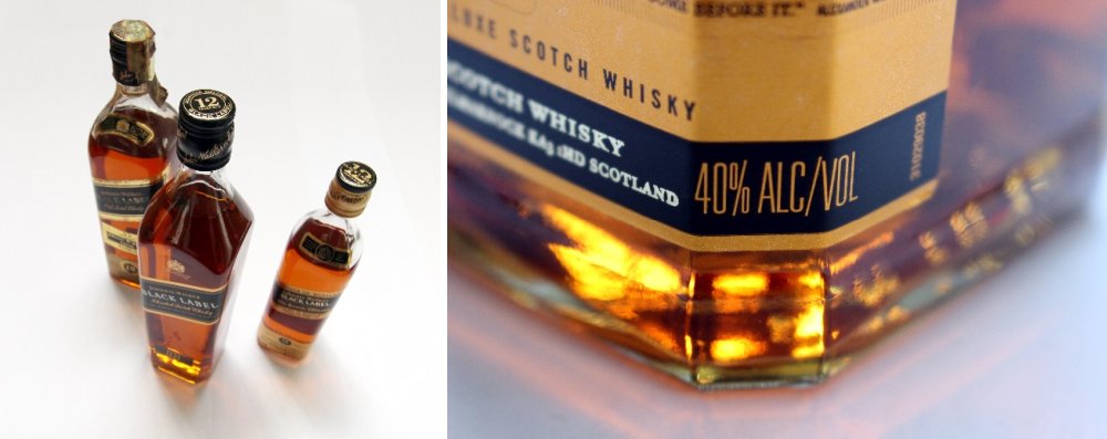
Product description.Johnnie Walker Black label is a blended Scotch Whisky created from whiskies that have been aged for a minimum of 12 years. It has an alcohol content of 40% The product in review is a 1 litre bottle from 2010.
Price and Availability.The Black label is one of those products that you simply expect to find in every liqueur store in the World. At the time of this review a 1 litre bottle averaged approx. $45 AUD. It’s quite normal to find it positioned in between the red label and double black.
Additional information.Johnnie Walker is one of the oldest Whisky labels on the planet with a story that begins in 1819. The first commercially available blend was launched in 1867 and called ‘Old Highland Whiskey’. The famous Red & Black Labels were born together in 1909 along with the striding man logo.
REVIEW
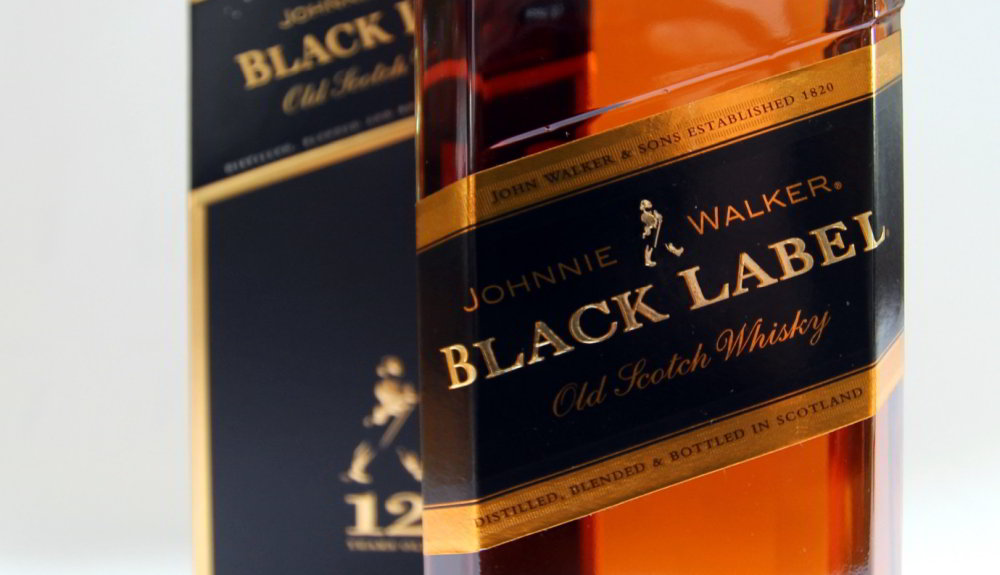
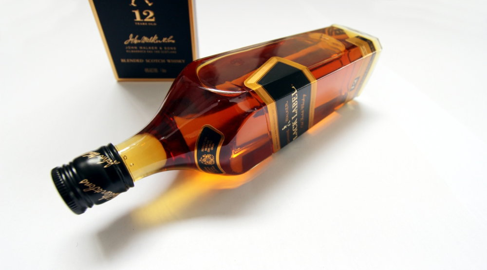
First impressions.Johnnie Walker Black label is iconic with a design that is instantly recognisable. For us the most unique aspect of the design is the square shape of the bottle which was designed originally in the late 19th century to reduce breakages so that the product could arrive at its destination intact. The slanted label is also unique to the Johnnie Walker brand at precisely 24 degrees. These two design features alone stand this product out from the crowd.
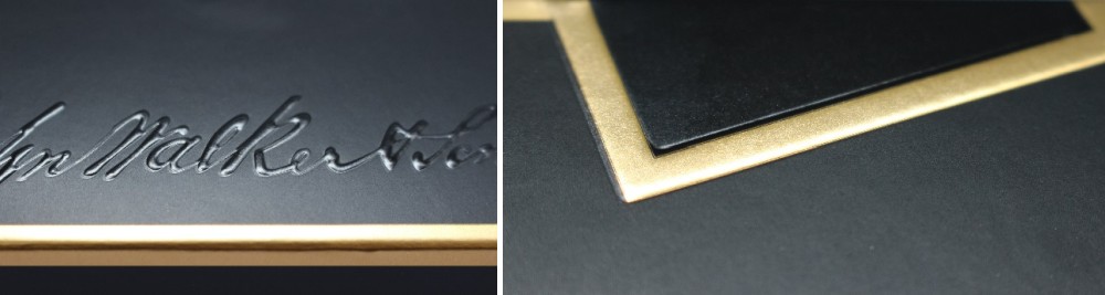
Packaging Design Review.While today there are so many variations and special editions available the Black Label is well known for coming packaged in a simple black box with gold graphics. The Box in review is deceptively complex and detailed. While it reads as just a black box with golden trimmings there is a lot of subtle variation in tones of blacks that also vary in level of sheen. Attention and detail is also in the texture and embossing of the graphics. While it’s just a basic cardboard box there is an impressive amount of graphic design work that achieves the feeling of pure class.
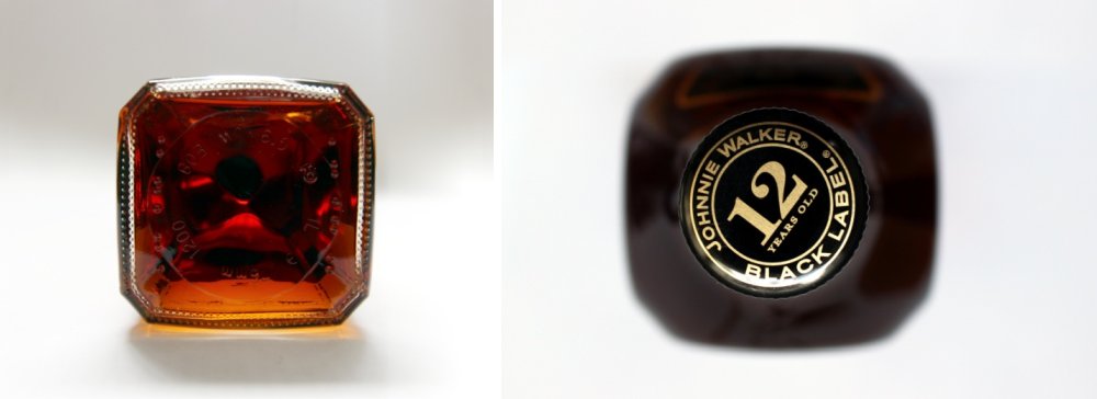
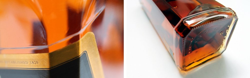
Product Design review.The bottle is iconic for its square shape and colours which we cannot deny feels very masculine. The way the bevelled corners transition into a circular top is clever and beautiful. The predominant colours of black and gold on the labels exude the 1980’s and still has a timeless classiness to it. There is golden honey like colour to the whisky that is very rich and alluring. The base of the bottle also has extra widening which one could assume has a practical purpose for increasing stability but it also just finishes the bottle as having a proper base. We noticed this base design as being unique to the 1 litre Black label bottles. Upon our research we think this crisper square design with extended base started appearing in the 1990’s.
There is a lot more in the design than meets the eye. For example, there is a crease mark line or slight indentation in the bottle just above the slanted label as if to frame it. The striding man is also embossed on the back of the bottle. It’s all very subtle and unassuming but that’s what makes it very special in our view.
Flavour / Experience.The iconic status of this whisky has often made it a benchmark for most other blends. It has been characterised as a smooth, deep and complex character. We are not experts and cannot comment much further on the quality of the flavour. It’s important to recognise that this is a blended whisky which many connoisseur’s will pride themselves in avoiding in favour of pure single malts. While it can be consumed neat or on the rocks we think this is a great whisky for mixing with soda or coke and that’s especially nice if you are thirsty.
it’s a whisky that should evoke memories as a result of longevity and popularity.
Desirability / Value for money.This is a very affordable whisky and one that will always be available as standard in any bar or store. In fact, you would almost certainly raise an eyebrow if a restaurant or bar had no black label. Ask your average person to think of a whisky and Johnnie Walker Red or Black should come to mind. There is nothing particularly rare about the standard bottle designs but we think this very square 1 litre bottle it’s a must have purely from a design perspective. The black label is not only an icon but has achieved legendary on screen status through both Blade Runner movies that have featured the blend in bottle designs that were even edgier. If you are interested to invest there are plenty of special or limited-edition bottle and label designs to choose from.
WORD OF THE WOLF.We were surprised at how high this product scored because it is such an unassuming design. Perhaps we are all more familiar with its squareness than we think. We think the colours and graphics work perfectly with the contents intense golden colour. The attention to detail is evident upon closer study and as designers we appreciate all the subtleties. Overall it is a very clever and beautiful design.
WOLF DESIGN EXCELLENCE SCORE = 8.1
Disclaimer.The information in this review is intended for informational or educational purposes to provide readers an understanding of how something may be seen from a certain design perspective. In this case it is from the view point of WOLF DESIGNS. As design is subjective this review should only be considered as an independent opinion. Information further to being of an opinion is provided to the best of our knowledge based on our own research at the time of doing the review. We cannot be held responsible for any inaccuracies or inconsistencies and reserve the right to change or update any content as appropriate. The final responsibility of the design resides with the original manufacturer.
http://www.johnniewalkerbottles.info/2010/01/black-1980s.html